A production in progress
Part 2 - the final touch

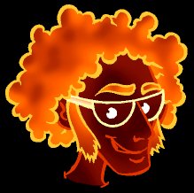
We had started to move in the right direction, but the hair was too brown to fit with the design of the site. Leif still looked more like a nerd than a party nerd. The site came with a suggestion in which the hair had been made more red, and asked if I could try to make it a bit more violet than their suggestion:

I changed the hair and made a violet version, as well as a version in which I had added a red filter to the whole illustration:


Now the colours worked, but Leif's expression wasn't cool enough. At first I made his smile a little wider, moved one eyebrow a bit down and added more shade to his sunglasses:

The facial expression was better, but not completely okay yet. At the same time it looked a bit like Leif had been decapitated. We didn't want to re-introduce the shoulders, because this would make the illustration too wide. I changed the eyebrow, and the shoulder problem was solved by just using the collar of Leif's shirt. At the same time we replaced his bare breast and necklace with a black T-shirt. In the first version the collar was too white, so in the following version it was made more blue, and at the same time I made the white glow thinner and made small corrections on Leif's eyebrow and at the corner of his mouth:


Now we added a soft violet background and made Leif even more cool (almost diabolical) by changing the other eyebrow as well:
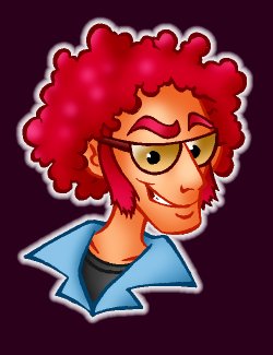
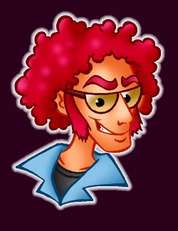
Leif was ready!
As a final correction I had to re-draw him far bigger than before, so he could
be used as a poster as well. I had not known that it had been planned to use him for posters
until quite far down the line of creating the design, so until now the original had not been
large enough to be used as a poster. Once again I cleaned up and coloured... and Leif was ready in
poster size:

I hope this example gives a good impression of the creative process, when creating an illustration. Of course the amount of corrections depend on Your wishes as a commissioner, and often the primary design works quite well... but this would be a bit boring to use as an example here!
If You have questions, please don't hesitate to contact me!