A production in progress
The whole course of the production will be described, and most things are illustrated as well. In this way, You can get an impression of how an illustration is being created as a co-operation between You as the commissioner and me as the illustrator. This example probably contains a few more corrections than an average commission, but this is exactly why it's a good example!
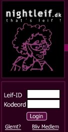
The illustration was used on posters and at NightLeif.dk, and all rights for use of the illustration are held by this site.
But let's get started!
Part 1 - getting started


The idea of creating him as a 3D-character was however dropped quite early in the process, and in stead a modified version of one of the sketches was added to the design of the web-page:
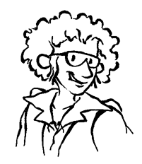
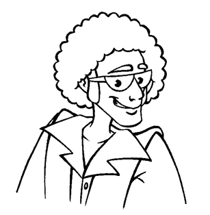
I found that this solution actually worked quite well, but Leif's facial expression should be changed so he looked like he was just a little more in control of the situation. Therefore I cleaned up the sketch, gave him a more self-confident expression and stuck to the black/violet design, that the site-designers had given him. The lines of the cleaned-up version of the sketch were a little to thin, so I tried to make them thicker, using my computer.
It was, however, too hard to read the drawing, and at first we tried to concentrate on
changing the design of Leif and make it more simple. We went through several different
designs, amongst others a design inspired by Fido Dido from the 80's and a design in which Leif
had had his hair and side-burns simplified:
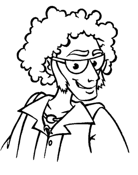
In the end we returned to the first design, since we still liked it more than the others.
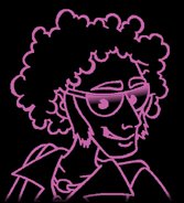
I tried cleaning up the design with thicker lines, and I used a stronger pink in the
version using black background:
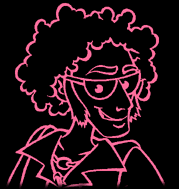
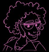
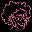
The result was better, but still unsatisfactory hard to read. This was mostly due to the idea of using bright red lines on a black background, thus creating a "negative" effect. We agreed to remove the shirt, so we wouldn't have to resize Leif's head too much for use on the page, and at the same time I created a coloured version as well:
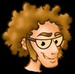
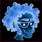
The coloured version worked far better, even at quite small sizes. Now the problem was that Leif had ended up looking too much like a nerd. The site came with a few ideas for corrections. A blue negative version that they would like to see in red, and an idea of giving him more reddish hair as well as adding a white glow to his contour:
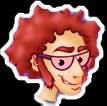
Leif was getting close to his final design.